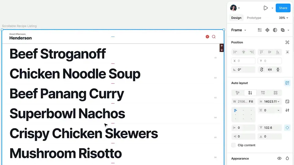
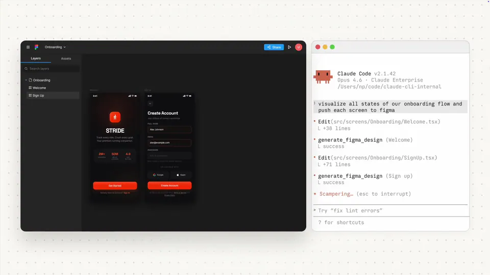
v0 now imports Figma designs with high fidelity, extracting layout, typography, and components to generate functional React code. This update enables an iterative workflow where developers can build complex UIs by componentizing Figma frames and applying custom design systems.
v0, a generative UI platform from Vercel, launched an updated Figma integration that converts static designs into functional code with high precision. The tool now parses specific design data—including layout, typography, and icons—to generate React components. It also introduces animation inference (automatically creating transitions based on design relationships) to handle motion.
- Imported data
- Layout, Typography, Components, and others
- Default design system
- shadcn/ui
- Styling support
- Tailwind CSS and custom configs
- Package support
- Any public npm package
This update addresses the design-to-code gap by moving beyond visual replication to deep structural understanding. While other tools recently added Codex's Figma MCP integration, v0's native integration allows for a more integrated generation process. It supports custom Tailwind CSS configurations and public npm packages to maintain specific brand design languages.
You can use this today by attaching Figma links within the v0 interface. Vercel recommends an iterative approach: import individual components like navbars separately before assembling full pages. This feature is available to all users, and the platform adapts to your style preferences as you use it.